


Crysandra’s: Before the doors open, the story begins.
A new destination for brunch, bubbles, and social dining is taking shape in Summerlin, Las Vegas.
Before the first table is set, we’re helping bring its identity and digital experience to life.
Boca Park Summerlin, Las Vegas
Anticipated opening, early 2027.
01The Beginning
Building the brand before the doors open.

Every memorable destination begins long before its first guest arrives.
For Crysandra’s, that meant creating an identity capable of introducing the experience before the restaurant itself was ready to welcome people.
- A visual language that feels elevated without feeling distant.
- Expressive without becoming excessive.
- Elegant, warm, and unmistakably personal.
Nebulight partnered with Crysandra’s to develop the creative foundation for a new hospitality experience coming to Boca Park in Summerlin.
The work began with identity, but the vision extended beyond it.
Project disciplines
- Brand Identity
- Creative Direction
- Brand Guidelines
- Copywriting
- Website Design & Development
- Print & Collateral
- Visual Content Production
02The Story Behind the Name
Personal from the very beginning.
Crysandra’s is more than a distinctive restaurant name. Its origins are rooted in family, bringing together Crys from Crystal and andra from Alexandra.

That personal connection became an important part of the identity. The creative challenge was to translate something deeply personal into a brand that could feel recognizable, refined, and welcoming.
Something intimate enough to feel meaningful. And distinctive enough to become a destination.

03Brand Identity
A distinctive identity. A world of possibilities.
The Crysandra’s identity brings together expressive lettering, refined metallic finishes, soft florals, and a warm, sophisticated color palette.
At its center is a distinctive wordmark and a versatile intertwined CA monogram. The system includes both floral and classic variations, allowing the identity to move between expressive and understated applications.
Every element was developed to feel connected. Not identical. Recognizable.


The identity system
Primary logo, wordmark, monograms and floral artwork, each with a role.


04Color & Character
Softness. Warmth. A little unexpected contrast.
The Crysandra’s palette moves beyond traditional pink-and-gold hospitality branding.
- Ivory#ECE2D6
- Blush#D6B8AE
- Rose#C68083
- Latte#B48F63
- Caramel#795531
- Olive#625C3F
- Mocha#5C453E
Ivory and blush create softness.
- Ivory#ECE2D6
- Blush#D6B8AE
Rose adds personality.
- Rose#C68083
Latte and caramel introduce warmth.
- Latte#B48F63
- Caramel#795531
Olive brings an unexpected earthy contrast.
- Olive#625C3F
Mocha provides depth.
- Mocha#5C453E
Together, the colors create a visual language that can feel romantic, contemporary, and sophisticated.

05Art Direction
Recognizable, even without the logo.
A compelling identity should be recognizable even when the logo isn’t present.
We expanded the Crysandra’s visual language through texture, atmosphere, and carefully developed imagery.


- Soft fabrics.
- Natural stone.
- Botanical illustration.
- Warm metallics.
- Champagne reflections.
- Subtle architectural forms.
- Organic shadows.
These details create a visual world that extends beyond traditional branding.


One designed to evoke the feeling of Crysandra’s before the physical restaurant is complete.
06Brand Applications
The details make the experience.
A brand becomes meaningful through the moments people encounter it. For Crysandra’s, we’ve explored how the identity can translate across physical and digital touchpoints.
From business cards and promotional banners to menus, signage, packaging, and hospitality details, the visual system was developed with flexibility in mind.
Some applications represent completed design work. Others are conceptual visualizations exploring the possibilities of the brand.
- 01Business cardsDelivered
- 02Promotional bannersDelivered
- 03MenusConcept
- 04SignageConcept
- 05TablewareConcept
- 06PackagingConcept


Together, they demonstrate how the identity can live beyond a single logo.
Concept Entry hall with monogram inlay
07Hospitality Vision
More than a place to gather.
Crysandra’s is being imagined as a destination where food, atmosphere, and connection come together.

Brunch
A place for celebrations.
Concept Morning service


Bubbles
For spontaneous afternoons.
Concept Etched glassware

Social Dining
For conversations that last longer than expected.


Our visual explorations help communicate the personality and atmosphere of the restaurant while its physical space continues taking shape.
08Digital Experience
The first front door is digital.
Before guests can walk through the restaurant’s doors, they can discover Crysandra’s online.
Nebulight designed and developed the initial coming-soon website to introduce the identity, establish anticipation, and begin building a connection with future guests.
crysandras.com coming-soon website


- 01The welcomeThe hero film and the opening line
- 02IntroducingThe identity first, then the story
- 03Morning into eveningBrunch, bubbles and social dining
- 04Made for momentsThe occasions it is built around
- 05Meet Crysandra’sThe family behind the name
- 06The detailsImagery and messaging, carried online
- 07The guest listPre-opening email sign-up
- 08The footerLocation and social links
Captured from the live site designed and developed by Nebulight Visit crysandras.com (opens in a new tab)
The digital experience brings together the brand’s typography, color, imagery, messaging, and subtle motion.
It also provides an opportunity for interested guests to stay connected as the restaurant approaches opening.

This is the beginning of the digital experience. Not the finished destination.
-
Now Delivered
- Brand identity & guidelines
- Copywriting & creative direction
- Business cards & promotional banners
- Coming-soon website & hero video
-
Next Planned
- Photography and video of the finished space
- An expanded website experience
- A custom reservation system
- CRM integration and management
- A broader SEO strategy
-
Early 2027 Anticipated
- Opening day in Boca Park

10The Work
A brand in the making. An experience taking shape.
From the first identity explorations to the coming-soon digital experience, our work with Crysandra’s has focused on building a cohesive creative foundation.
- 01Brand identity
- 02Visual guidelines
- 03Copywriting
- 04Art direction
- 05Print collateral
- 06Promotional creative
- 07Website design & development
Each element contributes to a larger story. One that will continue evolving as Crysandra’s moves toward opening day.

01Brand identity 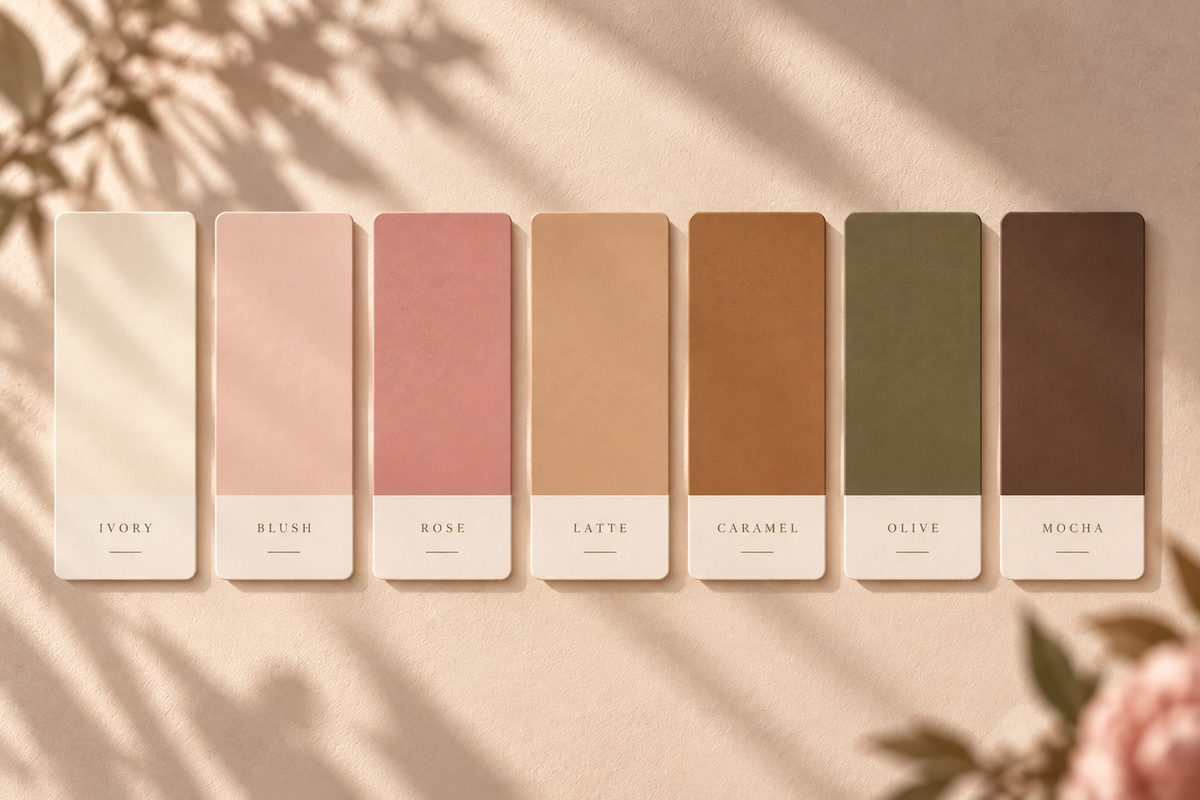
02Visual guidelines “Your new favorite table is almost ready.”
Pre-opening messaging · crysandras.com03Copywriting 
04Art direction 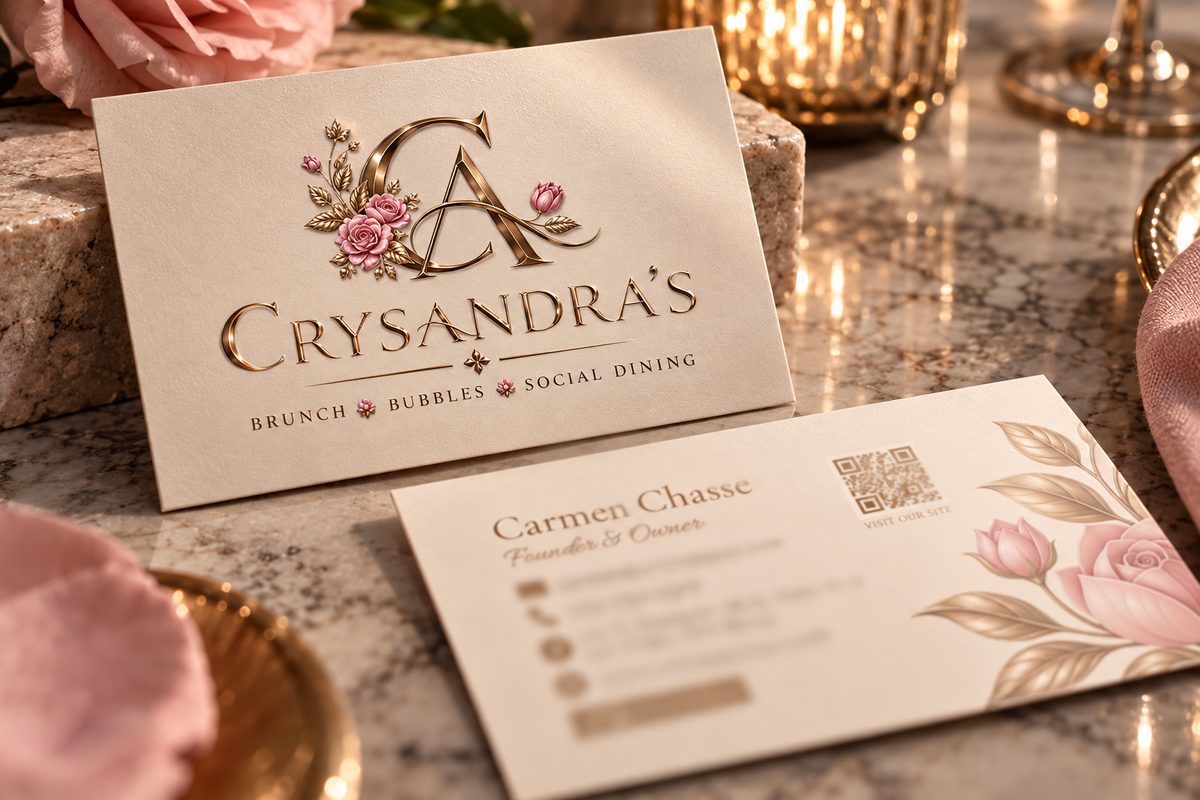
05Print collateral 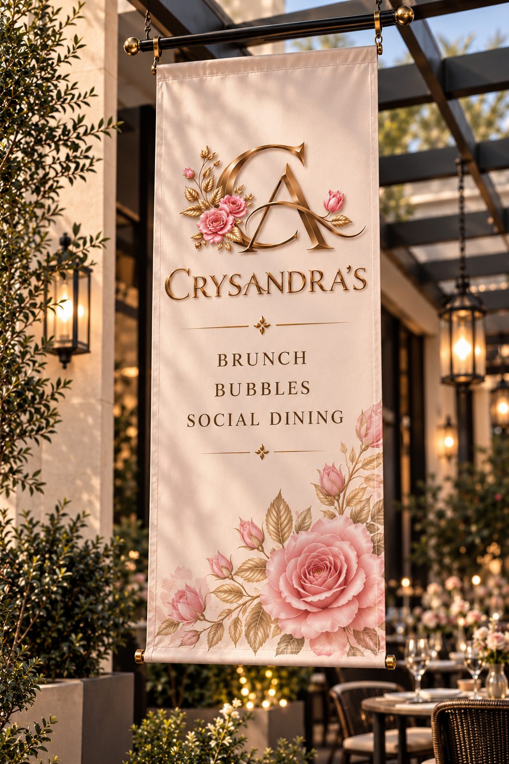
06Promotional creative 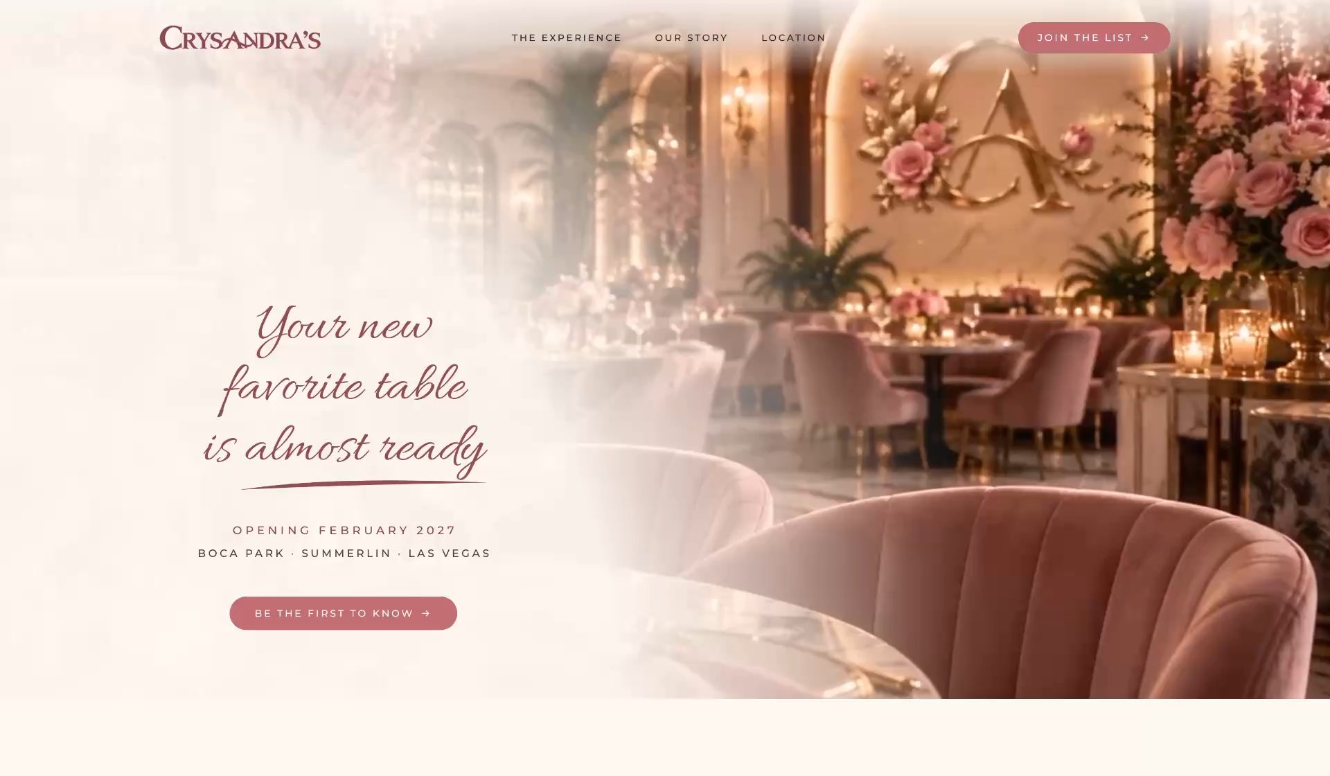
07Website design & development


Crysandra’s Summerlin, Las Vegas
Before the first table is set, the brand is already coming to life.
- Project status
- In development
- Anticipated opening
- Early 2027
Crysandra’s is still becoming a place. But its identity is already taking shape.
- A name became a brand.
- A brand became a visual world.
- And that world is beginning to welcome its first audience.
We’re proud to be part of the story as it unfolds.
Project credits

Client
Crysandra’s
Location
Boca Park
Summerlin, Las Vegas
Agency
Nebulight Creative
Project status
Ongoing · Pre‑opening
Expected opening
Early 2027
Completed & current work
- Brand Identity
- Logo & Monogram System
- Brand Guidelines
- Creative Direction
- Copywriting
- Business Card Design
- Promotional Banners
- Visual Content Development
- Coming-Soon Website
- Website Design & Development
- Website Hero Video